UX Design for Artificial Intelligence in Retail
A collection of case studies in artificial intelligence for mobile product and retail.
AI for Filtering Search Systems
For this case study I focused on how artificial intelligence can be used to filter out a vast inventory within a retail environment.
Research
There are strong benefits in combining ecommerce and artificial intelligence. AI can offer efficient personalized customer-retailer interactions. AI is also very data friendly, just like ecommerce. This also opens up an opportunity for brands to use data to interpret trends and adjust to provide a better customer experience.
Many online retailers have incorporated AI to assist customers in selecting an item from their inventory. There is Nike's initiative to "Find the right fit" and The North Face partnered with IBM Watson in selecting the right jacket based on climate.
Conversation Mapping
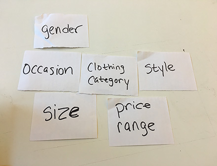
I conducted a user test in developing the information hierarchy before I designed the conversation. The audience I targeted were women between the ages 24 to 27. This age group were more focused on searching for a specific item for an occasion and considered size and price as a secondary yet still very important search.
The category hierarchy I structured:
- Womens or Mens
- Clothing Item
- Occasion
- Specifics of Item
- Size
- Price
Wireframes
Icon Design
For the navigation I wanted to design an icon that gave the feeling of a search filtering system and an AI component. I combined the standard filtering symbol of bars decreasing in size with the current trend of associating AI as a chatbot bubble.
The layout to take the user through the filtering experience is a short series of questions that aids in personalizing the inventory specific to the user. I also designed an opportunity for users to refer back to a previous question or option to skip questions. Users will also be able to understand the length of the process with a progress bar within the design. Below is the flow with a sampling of those questions for the retail giant ASOS. Visual prototype done in Sketch and interaction done in Framer.
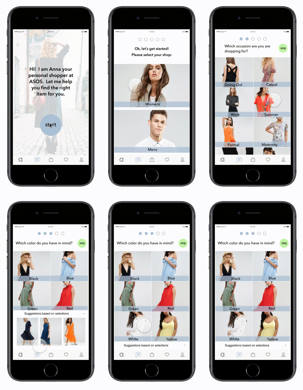
Icons in designs from The Noun Project. Images from ASOS.
AI for Digital Product
For this case study I focused on how artificial intelligence can fasciliate an efficient personal experience for mobile shopping and delivery application.
Research
I researched the popular grocery delivery app, Instacart, to understand how a user navigates through the inventory to select items to be placed in their virtual shopping cart. Two user scenarios became a common theme among my audience of men and women between the ages 27 to 32.
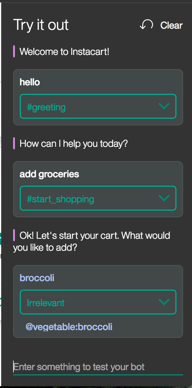
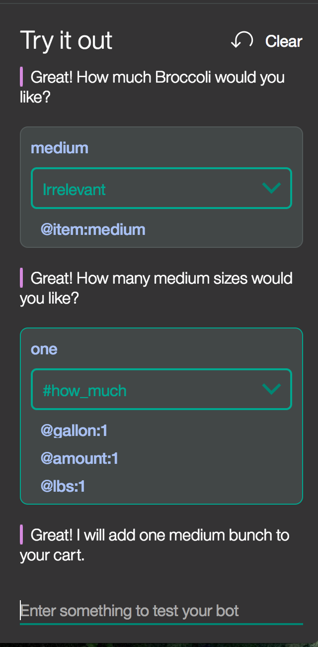
User Scenario 1: “How much broccoli do I need to purchase?”
This customer works 10 to 12 hours a day. She uses this application during hectic weeks when there visiting a physical grocery store. She usually has the challenge of figuring out how much of a type of produce she needs to purchase, as she is used to "eyeballing" the amount she needs.
User Scenario 2: “I want to just type in lasagna and all ingredients go into my cart.”
This customer splits time teaching middle school band, private music lessons, and raising her 1 year old child. Because she is constantly on the go between daycare and teaching, she uses this service to be able to spend more time with her family. Since she values convenience, she would like an opportunity to submit a recipe or dish that will automatically parse ingredients into her shopping cart.
Conversation Mapping
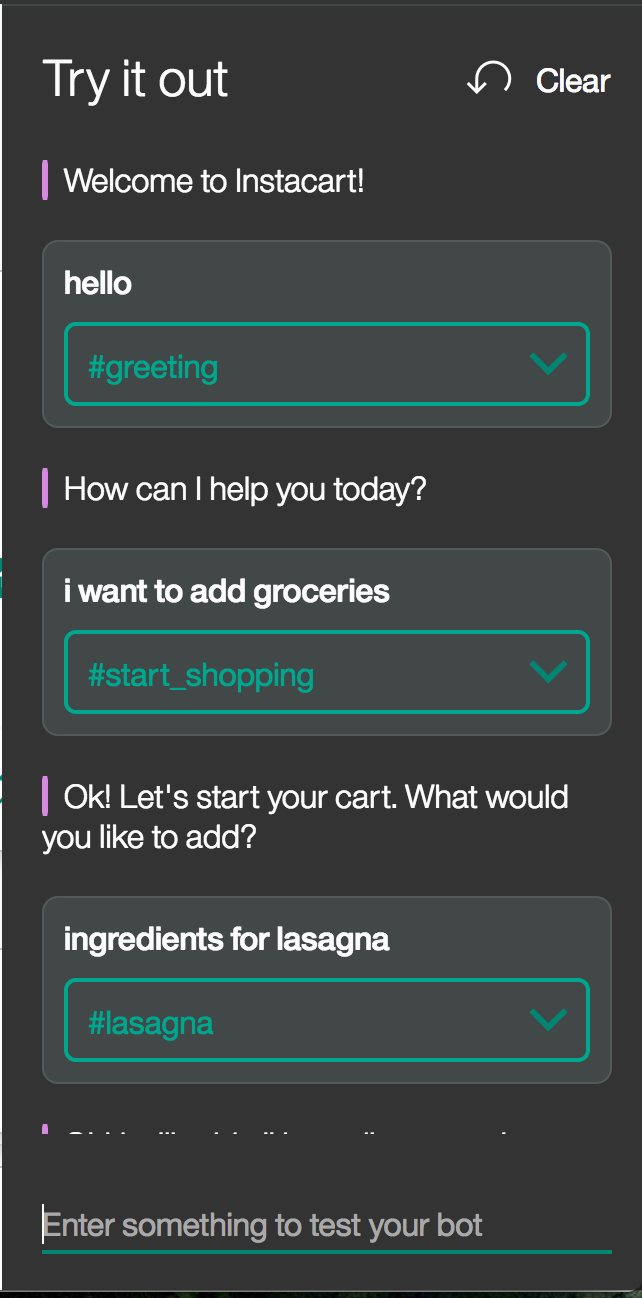
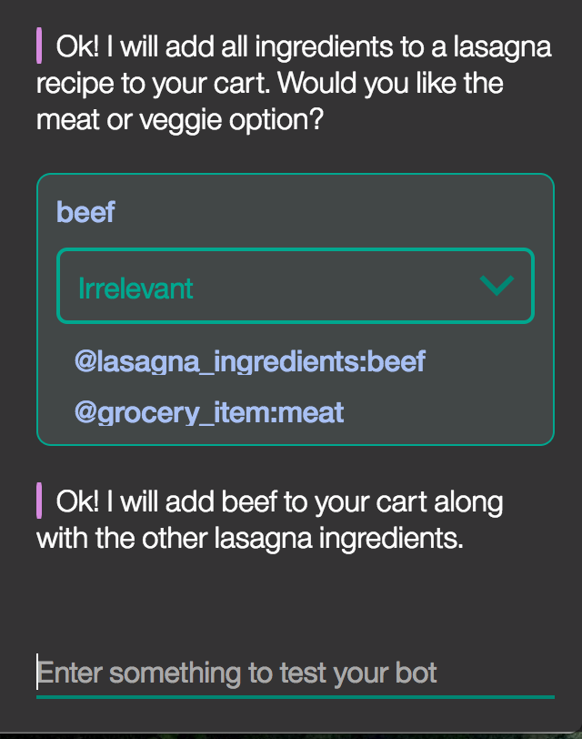
The conversation was mapped out in the IBM Watson platform as a chatbot system between human and AI asssistant.
Scenario 1
Scenario 2
